In short, my cat is sick and bite me as i was helping to hold him during treatment. So now my mouse clicking arm hurts a lot
Journals110
Newest
Undiscovered Weekly
3 min read
Join the community to add your comment. Already a deviant? Log In
Join the community to add your comment. Already a deviant? Log In
A little bit of fractal statistics
7 min read
Well, there was this random discussion about nature of art. I started discussing it as a sort of a classification problem, and people complained I was bringing statistics into art 
So I decided to actually do a bit of statistics about fractals.
My first project, inspired by what Esherymack is doing, is to study the colors I use in my artwork.
My idea was to find the dominant colors for each work. Then, I could find clusters of those color profiles, and find out which combinations are the most common. So color profiles for each artwork are the first step.
For this task, I used the k-means idea presented in this article: zeevgilovitz.com/detecting-dom…
The basic idea of using k-means to find dominant colors is that you take the color of each pixel, and then separate those in k groups, based on similarity between colors. For example, with a small number of groups, red and orange would go into same group, but blue would go into a different group.
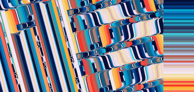
So now I could get the dominant colors for any picture. 50 dominant colors, why not? Here you go, 50 shades of disc for you:
The optimal number of clusters may vary from one image to another. But since I wanted to group the resulting profile later on, I decided to pick some number that would work well for most. For the clustering part, I used color profiles with 10 dominant colors for each image.
This method returns the colors in no specific order. Since I wanted to also display the results visually, this was not cool, since this looks kinda messy. Once more, I was too lazy to think of something by myself, and used somebody else's results: www.alanzucconi.com/2015/09/30… Out of the described methods, I liked the Hilbert curve sorting the most, and it was the method I used. On the picture above, the colors on the right are ordered using a Hilbert curve.
Now that I had the tools to describe the colors of each image, I applied it on 1118 artworks from my gallery. For clustering, I would need to define some sort of distance measure between two profiles, a number that would describe how different the colors of two works are. The main trick here is that the colors come in no specific order: an image can have green and blue, but also can have blue and green, and my measure would need to somehow accommodate this.
Meanwhile, another pic to make sure you are following:

After messing around a bit, I ended up with the following: given two color profiles, A and B, I would pair the colors of A with colors of B in such way that the sum of differences between each pair would be the smallest possible (say hi, Hungarian algorithm).
I also tinkered a lot with the distance measures between pairs of colors, ending up with a weird function of HSL, which seemed to work the best for the case.
Finally all I had to do is to run some hierarchical clustering, using the distances I calculated previously.
I use a lot of different coloring schemes Most of the time, though, I am not fun at all. The most common color combination among my work was a gradient of brown, sometimes red, with small additions of other colors. This color scheme is used in 22% (almost one fourth, shame on me) of my works.
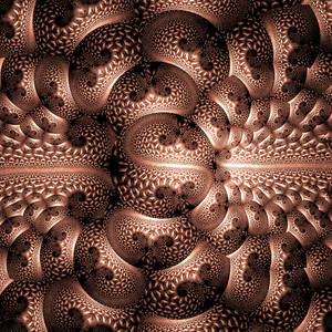
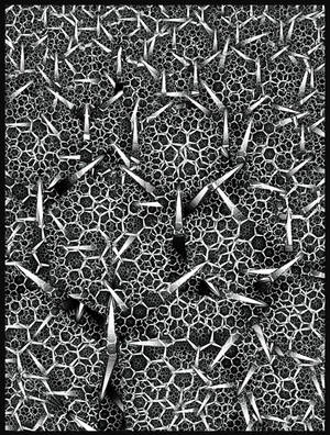
A few works representative of this group:

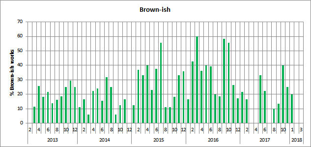
I make those pretty much at constant rate, and it was obviously my favorite color scheme during 2015 and 2016 - at some months, 50-60% of my work were basically brown. Below, you can see the % of brownish works out of all submitted, by month:
A second typical coloring scheme observed was black and white. Over the years, I made 55 black and white stills (5% of the studied artworks).

There are a few other typical color profiles, but they are overall less common than those two.
So I decided to actually do a bit of statistics about fractals.
My first project, inspired by what Esherymack is doing, is to study the colors I use in my artwork.
The dominant colors and sorting
My idea was to find the dominant colors for each work. Then, I could find clusters of those color profiles, and find out which combinations are the most common. So color profiles for each artwork are the first step.
For this task, I used the k-means idea presented in this article: zeevgilovitz.com/detecting-dom…
The basic idea of using k-means to find dominant colors is that you take the color of each pixel, and then separate those in k groups, based on similarity between colors. For example, with a small number of groups, red and orange would go into same group, but blue would go into a different group.
So now I could get the dominant colors for any picture. 50 dominant colors, why not? Here you go, 50 shades of disc for you:

The optimal number of clusters may vary from one image to another. But since I wanted to group the resulting profile later on, I decided to pick some number that would work well for most. For the clustering part, I used color profiles with 10 dominant colors for each image.
This method returns the colors in no specific order. Since I wanted to also display the results visually, this was not cool, since this looks kinda messy. Once more, I was too lazy to think of something by myself, and used somebody else's results: www.alanzucconi.com/2015/09/30… Out of the described methods, I liked the Hilbert curve sorting the most, and it was the method I used. On the picture above, the colors on the right are ordered using a Hilbert curve.
Clustering nightmare
Now that I had the tools to describe the colors of each image, I applied it on 1118 artworks from my gallery. For clustering, I would need to define some sort of distance measure between two profiles, a number that would describe how different the colors of two works are. The main trick here is that the colors come in no specific order: an image can have green and blue, but also can have blue and green, and my measure would need to somehow accommodate this.
Meanwhile, another pic to make sure you are following:

After messing around a bit, I ended up with the following: given two color profiles, A and B, I would pair the colors of A with colors of B in such way that the sum of differences between each pair would be the smallest possible (say hi, Hungarian algorithm).
I also tinkered a lot with the distance measures between pairs of colors, ending up with a weird function of HSL, which seemed to work the best for the case.
Finally
Results
I use a lot of different coloring schemes
A few works representative of this group:

I make those pretty much at constant rate, and it was obviously my favorite color scheme during 2015 and 2016 - at some months, 50-60% of my work were basically brown. Below, you can see the % of brownish works out of all submitted, by month:

A second typical coloring scheme observed was black and white. Over the years, I made 55 black and white stills (5% of the studied artworks).

There are a few other typical color profiles, but they are overall less common than those two.
Join the community to add your comment. Already a deviant? Log In
Undiscovered Weekly
3 min read
Join the community to add your comment. Already a deviant? Log In

